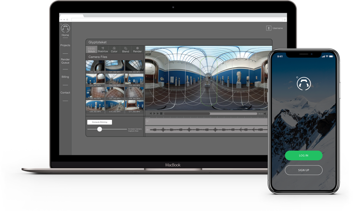
The Cloud Studio is an ongoing team project, where I’m responsible for the user experience and user interface design of the product. My main goal is to provide the users with an all-in-one solution for their 360º post-production needs. The following is a description of my process so far in this project.
UX Researcher
UX Design
UI Design
The original research was conducted by performing interviews with five potential customers from two different business segments.
The interviews were conducted to better understand our users and to find the pains on their current work systems. To find ways to solve this issues with features on the cloud studio.
The interviews helped to discover the areas where the Cloud Studio could improve the user’s post-production work by focusing on solving main problems they were facing with their current workflow.
The focus areas found from the research were the following:
Using the findings from the user research I developed a user map study focused on the costs and the income generation flows, this helped to figure out how the Cloud Studio could save the users in costs and to make it easier for them to generate income.
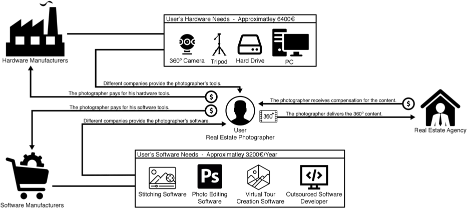
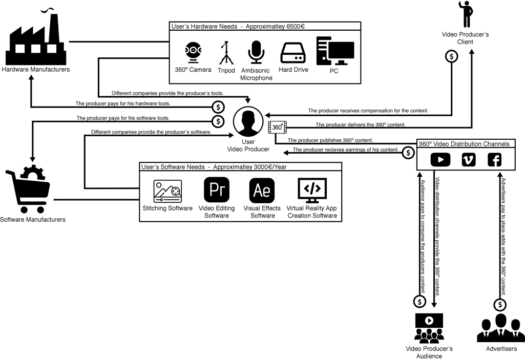
After a thorough analysis of the user needs it was decided that the five main areas of focus could be resolved by prioritizing on the income generation (which included sharing/publishing) and simplification of the workflow (which included managing files and stitching).
The following user flow was created to act as a guide for the design of Cloud Studio.
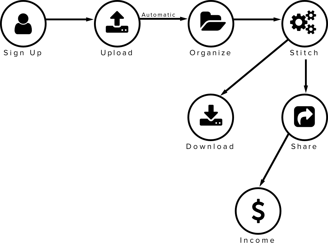
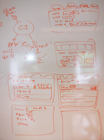
The next step was the UI design following the user needs and user flow. The design started on a whiteboard wherein a team conformed by a designer (me), a developer and a project manager a brainstorming session was conducted to decide on the main screens and navigation system.
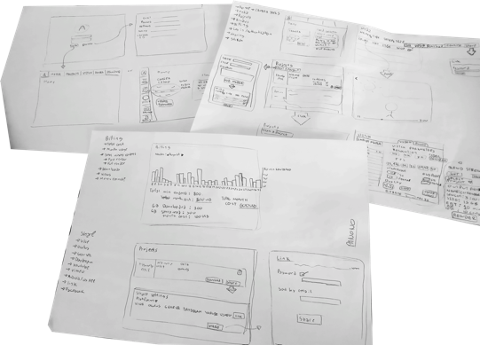
After the whiteboard, the screen wireframes were refined on paper, during this step more decisions were taken and changes were done quickly, with several iterations done on paper sketches.
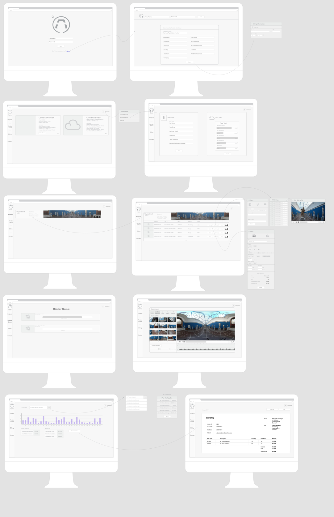
Once the paper wireframes were approved the design is continued in Sketch.
The development of the cloud happened almost simultaneously with the design, so the usability tests were performed on coded prototypes. The current users are members of an A-testers program and they collaborate with us to build a better product for them and for future users.
I have been working with the users remotely to find how can the Cloud Studio be improved. We do this by using share screen software and I observe while they perform different predefined tasks. This helps me to understand where are the usability bottlenecks and what aspects of the interface are not working as originally planned.
The first findings came in the way that the cloud was performing on different screen sizes the responsiveness was not working appropriately.
The second finding came after thorough testing and it affected a large aspect of the cloud. Users were finding confusing having their projects on both the “Projects” page and the “Render Queue” page and thanks to a user comment we decided to merge this two pages into one, adding the rendering section to each project.
The main goal of the visual style was to have a very professional and clean design. The tool needs to appeal to professional 360º content producers. The inspiration for the visual style came from other professional video and photo editing software solutions.
